Aligning the desktop and mobile versions of a social film platform
CLIENT
Craft Studios
MY ROLE
Designer
TIMELINE
24 hours
During the application process to Craft Studios, applicants are tasked with selecting a digital experience and improving it within a 24-hour timeframe. They must deliver high-fidelity screens that represent the recommendations provided.
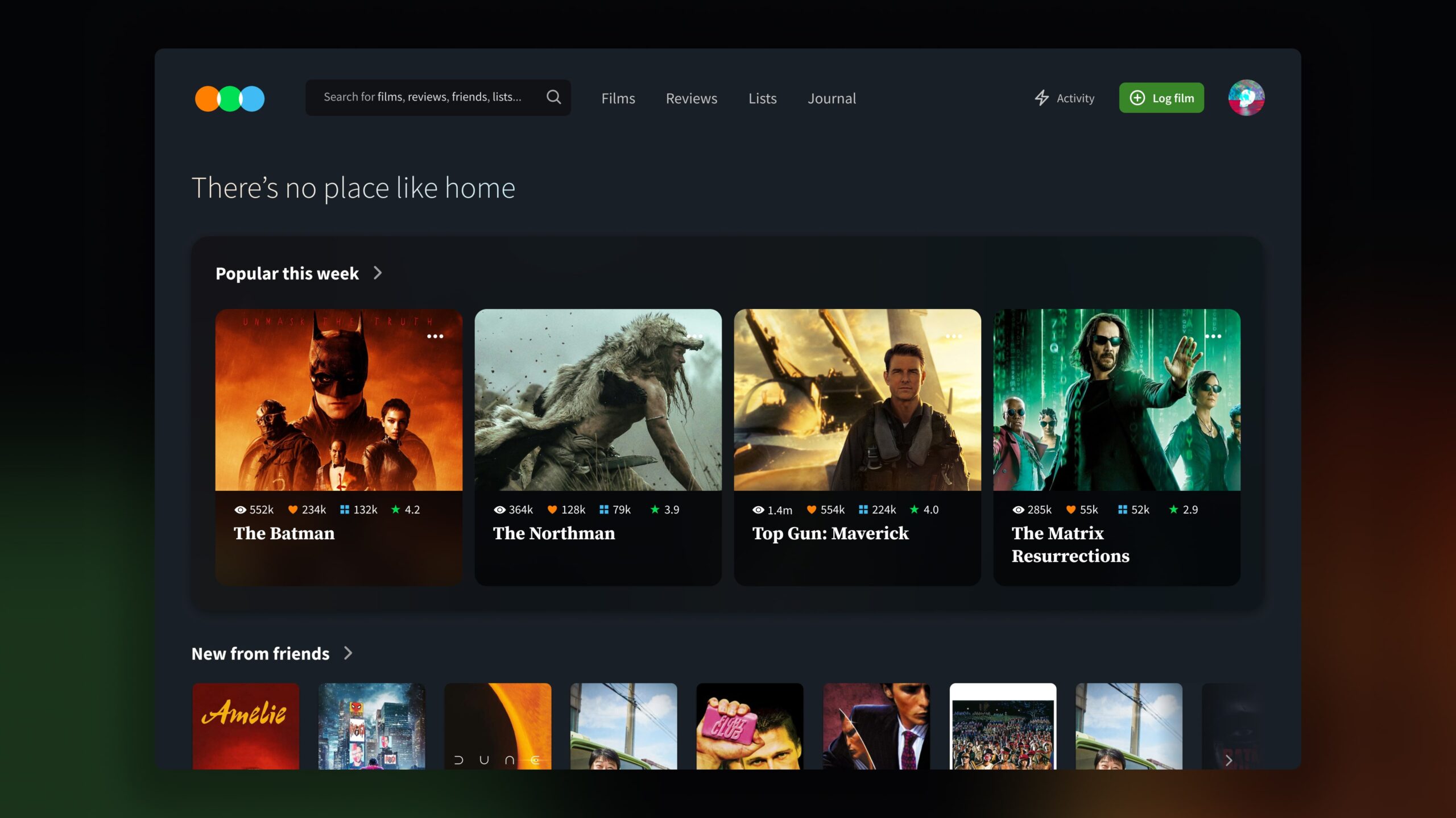
I wanted to align the mobile and desktop versions of Letterboxd, a site where users can share and log their film-watching experiences.
Analyzing the current desktop experience
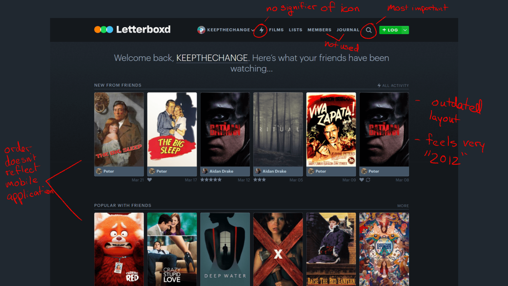
Before jumping into any design sketches, I took a brief moment to evaluate the current Letterboxd platform and some of the adjacent competitors such as IMDB and Rotten Tomatoes.
I noted some areas that I felt could use improvements based on my experience using the site.
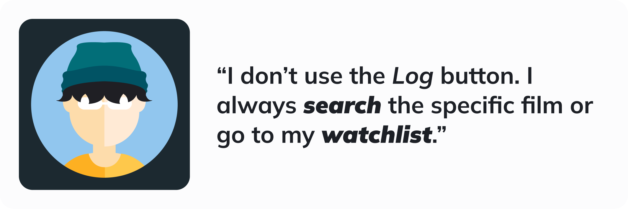
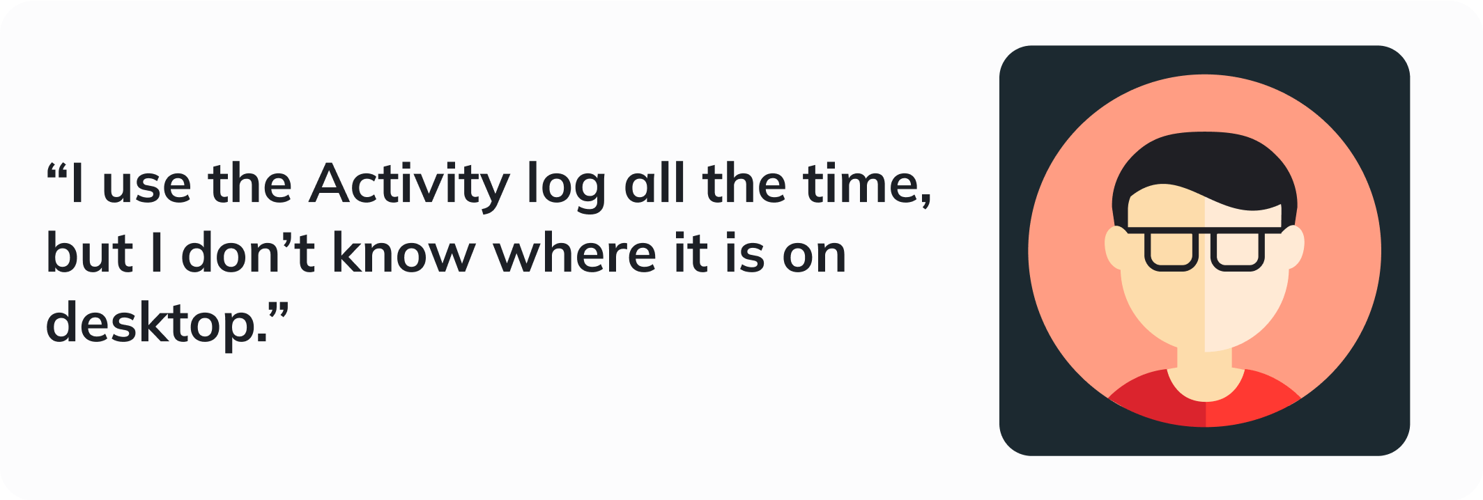
Gathering quick data via my friends
I messaged several friends who are Letterboxd users to get some input about the areas that I had noted during the heuristic analysis. With the opinions of several users as well as my own assumptions, I was able to reorganize the structure of the navbar to prioritize the most important functions.
Refining the data into designs
After quickly sketching some ideas, I jumped straight into high-fidelity wireframing. If given more time, I would have spent more time during this step to explore more homepage variations.
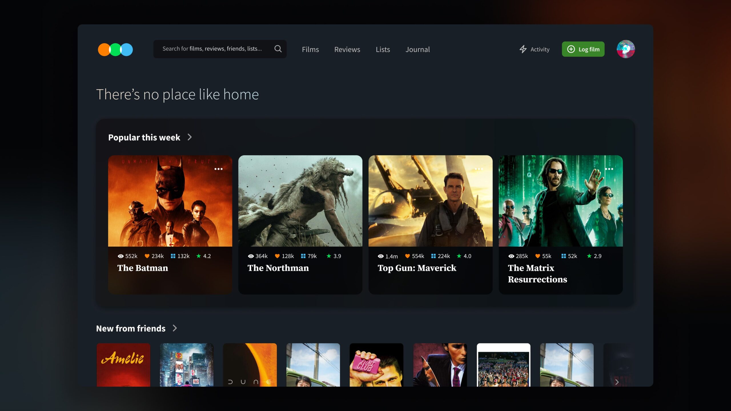
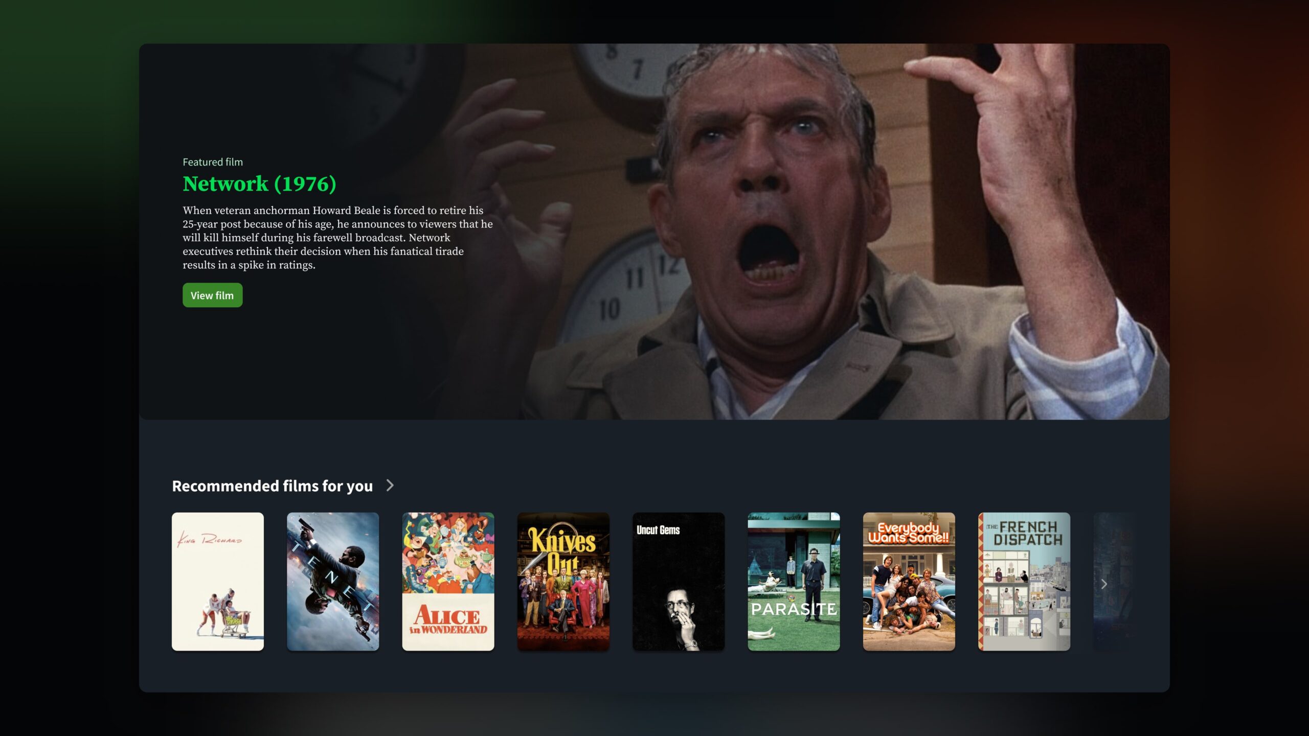
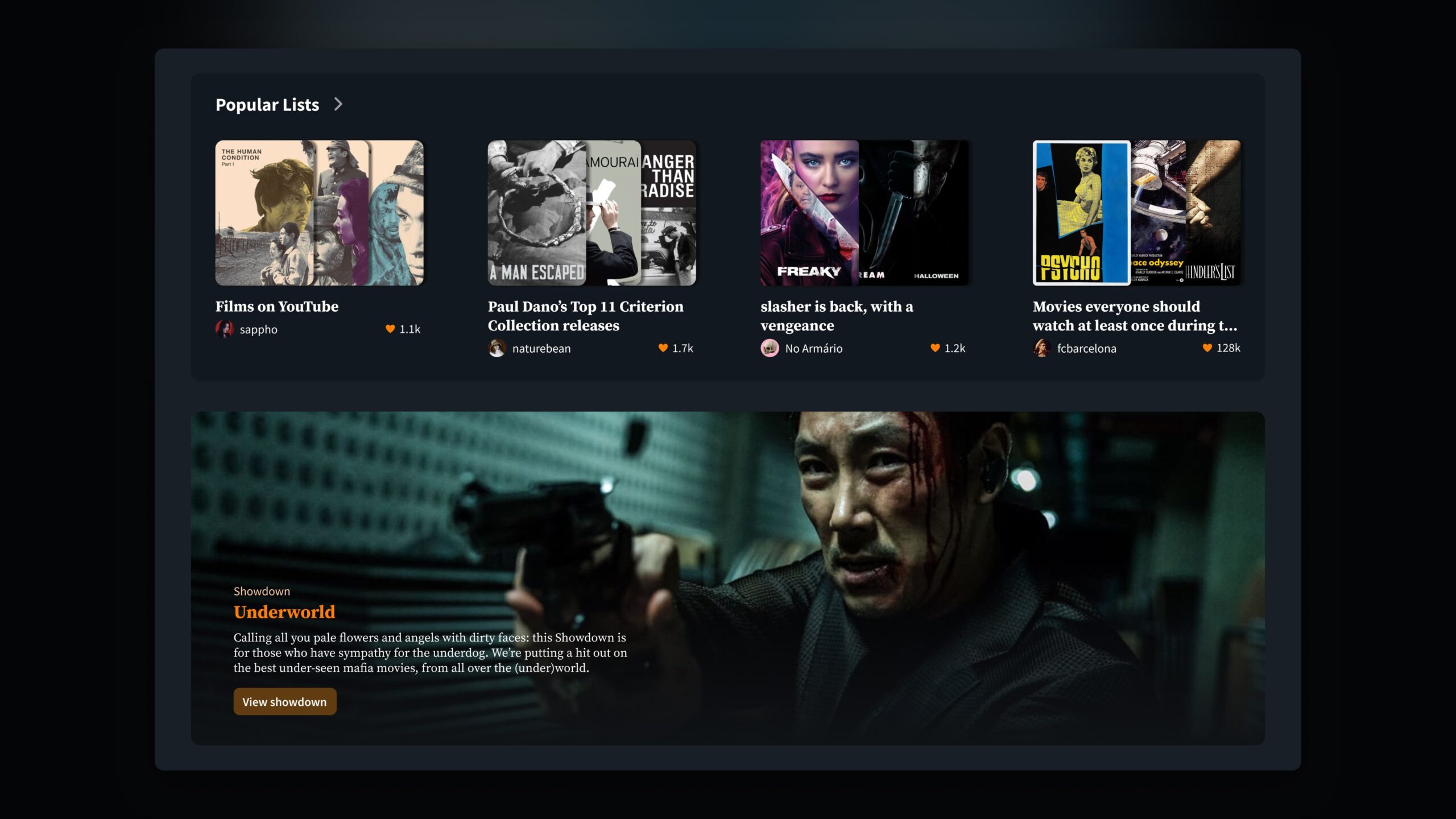
My main goal was to structurally and stylistically redesign the desktop homepage to be more consistent with the Letterboxd experience on mobile devices while adding some new elements that I feel would make the user experience more engaging.
Retrospective
This was a fun exercise that helped essentialize the UX design process. It forced me to identify the key steps are in evaluating a current experience, gathering user research, and executing a design concept within a short amount of time.
With more time...
I would have liked to gather more user research to inform my design decisions better, build out more screens to represent an entire process flow, and also explore how this design would scale to tablet and mobile sizes.
Interested in working together? Get in touch!
Tynan Drake
UX Designer
Philadelphia, PA
tynandrake@gmail.com