Daytrip - Improving the collaborative trip planning experience
MY ROLE
Lead UX Designer
TEAM
Project manager,
2 designers, 3 developers
TIMELINE
9 months
Daytrip emerged from a chaotic attempt to plan a spontaneous day trip to New York City. As an overworked college student, I postponed the planning until the last minute. I downloaded a bunch of travel apps and found them to be either overly complex or trying to sell me an airline ticket.
Frustrated, I decided to create my own solution - Daytrip.
My role
I led the UX design, handling information architecture, user flows, screen designs, animations, and video assets. Collaborating with a project manager, a designer, a researcher, and three developers, we aimed to build a user-friendly app.
Brainstorming user types, pain points, and opportunities
I set up an internal workshop to align on our assumed users, their pain points, and potential opportunities.
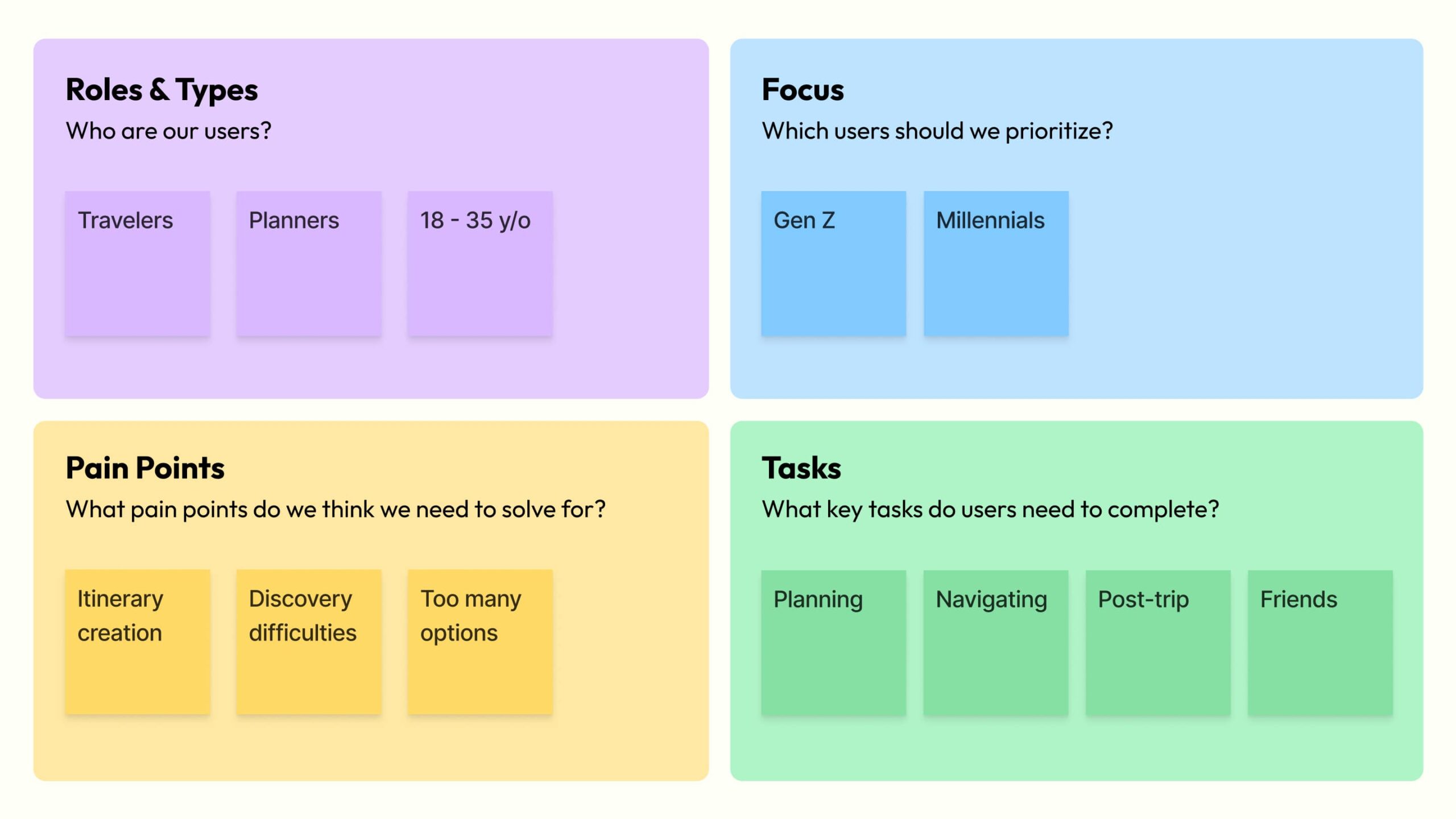
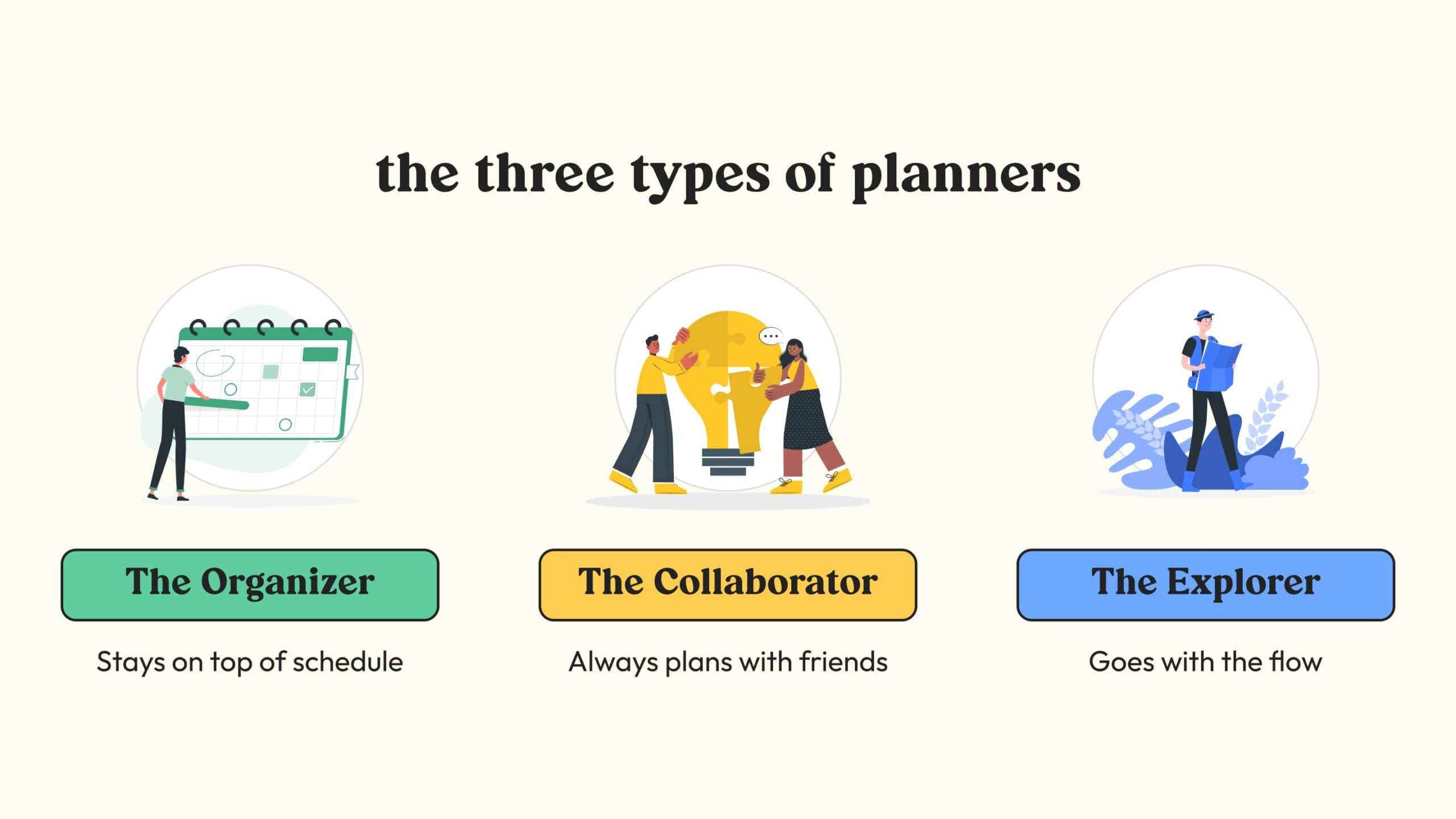
Identifying user types
Our lead researcher then developed surveys and interview scripts to refine our understanding of key users.
Design process for the Itinerary/Trip page
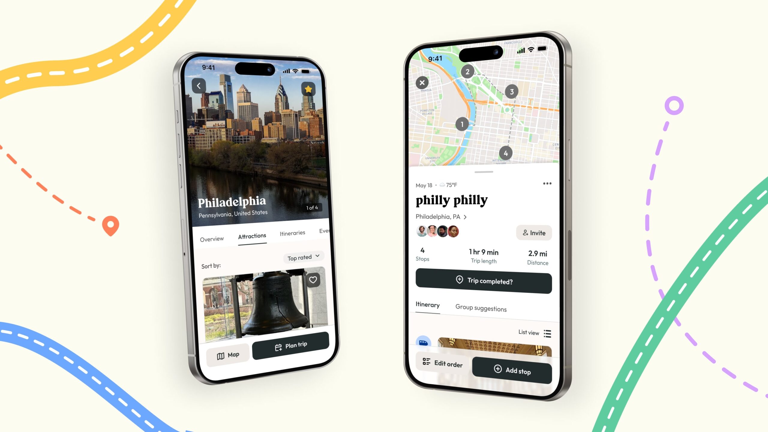
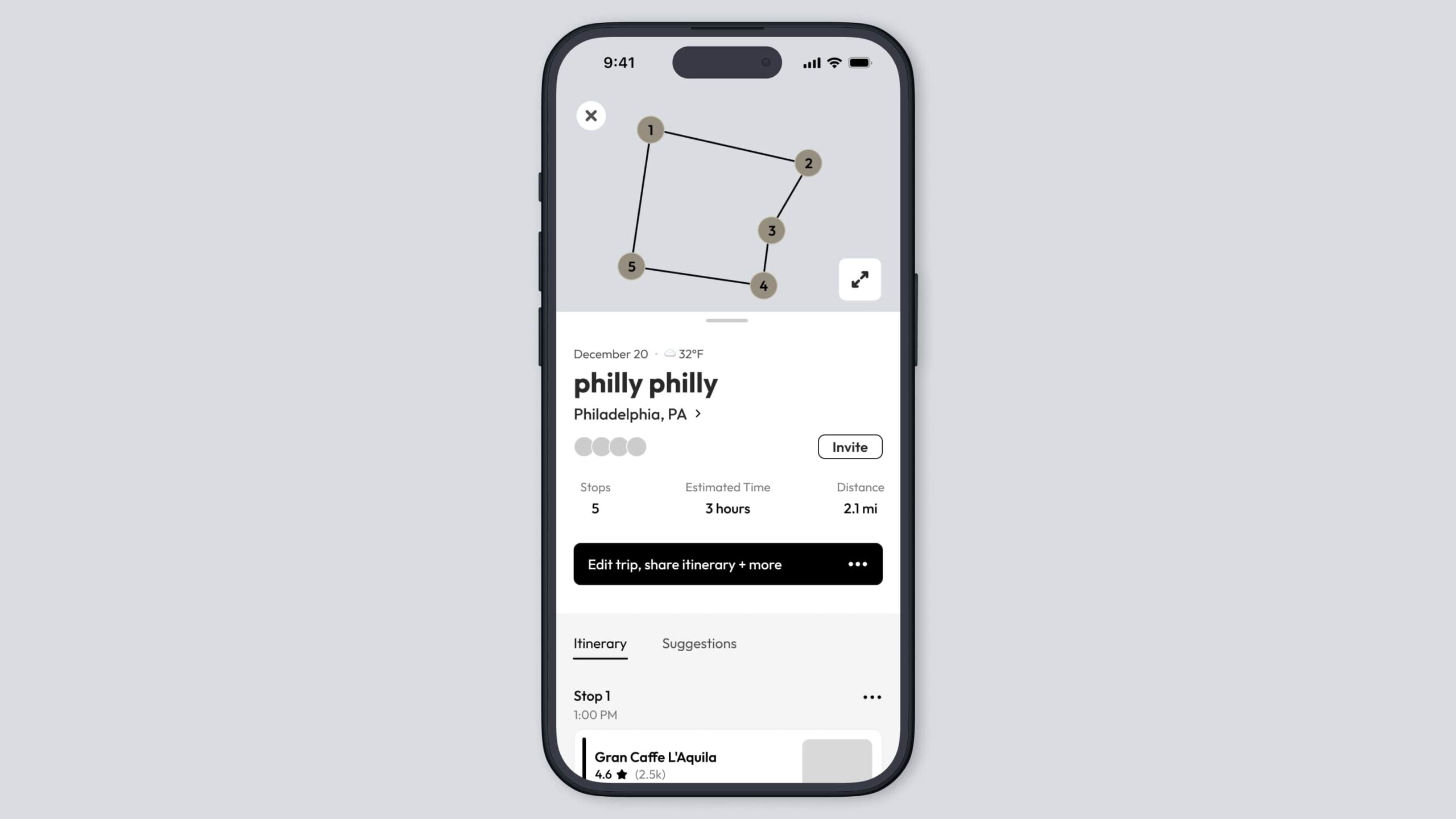
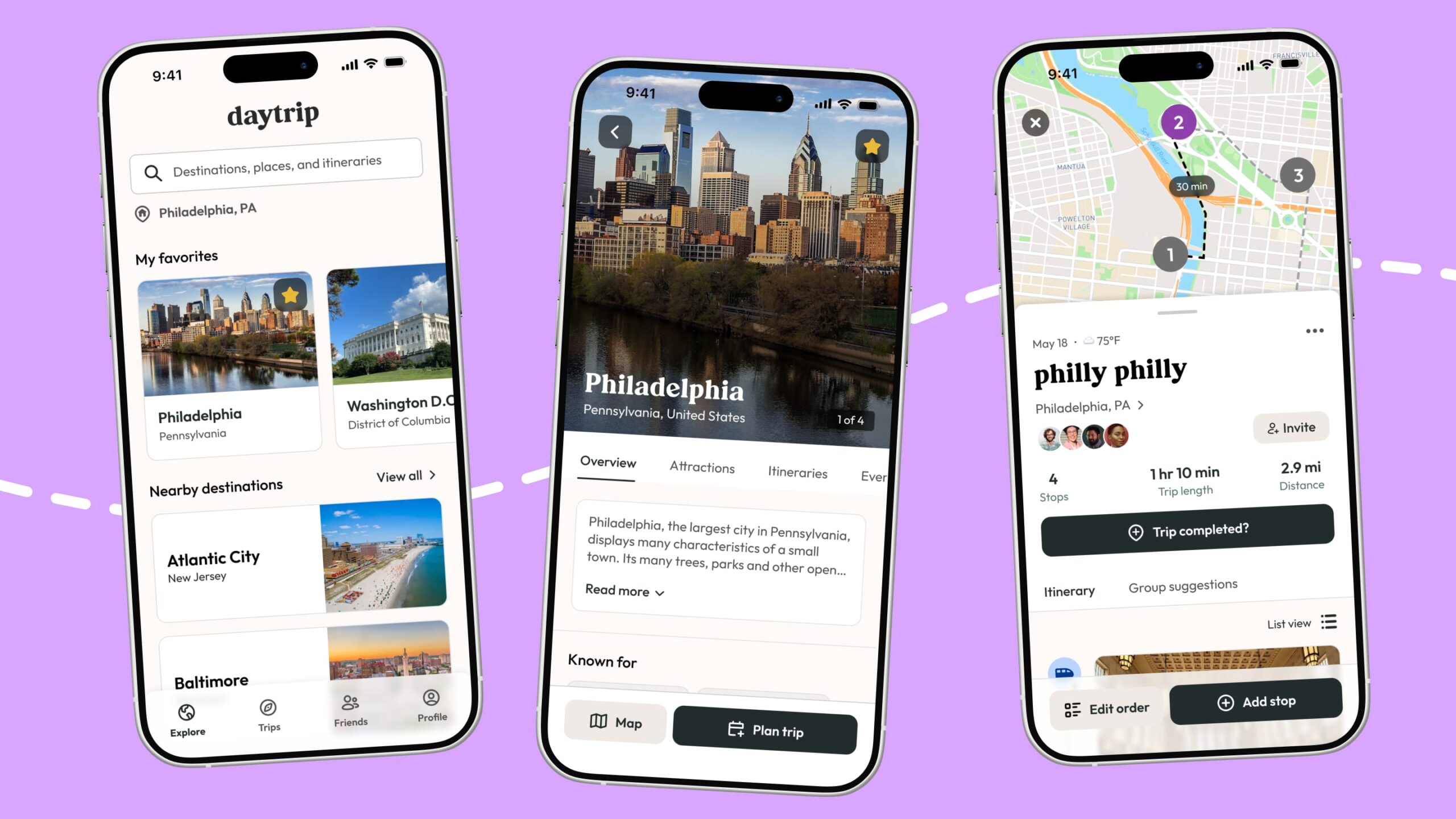
The most challenging screen to design was the Itinerary page. This is the core flow for the application so it was essential that the design and functionality was clear, concise, and easy to use.
I went through many iterations before landing on the final design.
Exploration 1 - Initial design
Concept
- Initial pass at designs
- Accounts for key user actions
- Exploring maps
- Inviting friends
- Viewing routes
- Adding stops
- Group suggestions
Rejected
- Too many CTAs making it hard to find key functions
- Group suggestions feature poorly placed if the number of suggested places increases
- Images for each stop were too small, making it hard to distinguish them
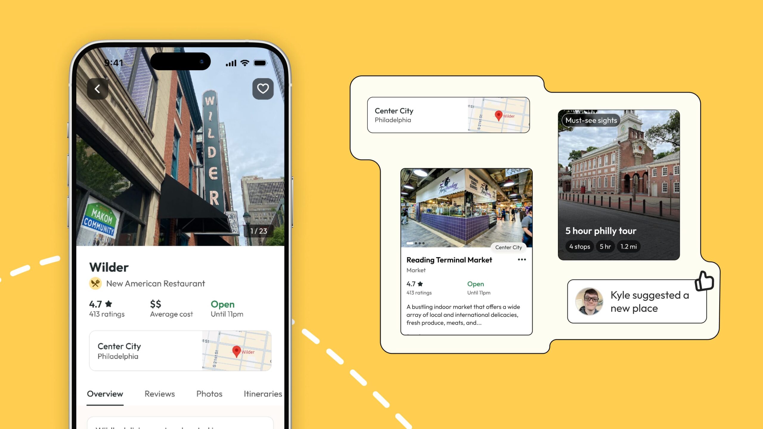
Exploration 2 - Integrating the map
Concept
- Added a map. Users felt it was important to be able to visualize their plan
- Condensed the CTAs into a single button with a modal
- Moved Group Suggestions to a separate tab
- Iterated on the Stop card designs
Rejected
- Single CTA was not intuitive to users
- Users missed the "Distance between" info, a key feature.
Exploration 3 - Refining the design to be more visually focused
Concept
- Redesigned the Itinerary section to be visual and integrated with brand identity
- Iterated on the CTAs to be more clear
- Added "List View" so users can get condensed view of itinerary
Selected
- Found the right balance between info provided, clear CTAs, and visuals
- Addresses the main pain points expressed during research
- Visually interesting and unique from competitors
Detailed design, delivery, and development
After iterating and refining all of the screens, I moved into the detailed design phase so that I could handoff designs to the dev team to begin development.
Throughout this phase, I was in constant communication with the devs to ensure that they had all of the screens, states, and documentation required to code the application.
Trust the process, sort of...
This project required extensive research, sketching, iterating, testing, and refining. I learned that following the process maximizes impact, while skipping steps leads to extra work or poor design. Since the design process is often non-linear, returning to previous phases is frequently necessary.
Plan appropriately
Another lesson learned is to not box yourself in with tight deadlines. Design and refinement will take longer than you think, so budget yourself an adequate amount of time to deliver a good product.
What I'd do differently
I was confident in the user data we received, but I’d prefer to get user feedback throughout the process to validate our decisions. Our tight timeline made it hard to set up as many testing phases as I'd like.
Development on Daytrip will continue. Stay tuned
Interested in working together? Get in touch!
Tynan Drake
UX Designer
Philadelphia, PA
tynandrake@gmail.com